NewDay is one of the UK’s biggest credit providers on a mission to help people to be better with credit. The mobile white-label platform powers 5 direct to customer brands; Aqua Card, Fluid, Marbles, Opus, Pulse, and also B2B partner retailers, providing credit for their customers; John Lewis, Amazon, Argos, Arcadia Group, House of Fraser, Debenhams, TUI and many more.
Lay of the land
Taking a look at NewDays current mobile platform, approximately 95% of the screens that make the app are embedded web views. The screens don’t support native features like push notifications, no native components and lacks personalisation. When compared to competitors in the market, other challenger banks like Monzo, Starling Bank, Revolut are years ahead and NewDay is falling behind.
Our goal was to redesign the white-label platform powering the mobile apps, by incrementally moving towards a more native experience for both Android and iOS.
Using best practice and building confidence with stakeholders
To educate the business, and guide the designers in my team, I embedded the below process and ensure as a team we are achieving the best outcome for the customer and using best practice by starting and ending with the customer.
Design process and activities to educate stakeholders
Benchmarking the current experience
We first need to take an objective look at that current experience and communicate why to the business this was such an important area of the app to get right, and benchmark the current experience with customers by getting their feedback rather than relying on AppStore reviews as a source of customer feedback.
Stacking up against competitors
Time to analyse and compare the competition to identify where NewDay stacks up against other credit card apps in the market. We compared by identifying pros and cons, features, functionalities and product execution. This exercise highlighted some good areas to explore for NewDay.
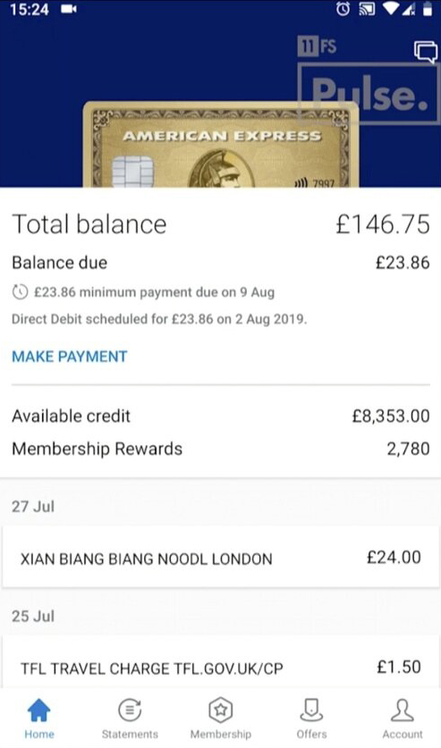
American Express
Pros Clear card visual, Total balance is clear, balance due and reoccurring payment
Cons Transactions aren’t clear to read, no information heirarchy
Starling Bank
Pros Good animation, reverted colours are different
Cons No recent transactions, chart takes up a lot of space
Barclaycard
Pros Clear balance and available credit, separated pending transactions, clear merchants in transactions
Cons No clear heirarchy, flat
Vanquis
Pros Clear payment action, pending transactions, clear direct debit
Pros Clear amount owed, clear banners to drive action
Cons Big circle graph takes up space
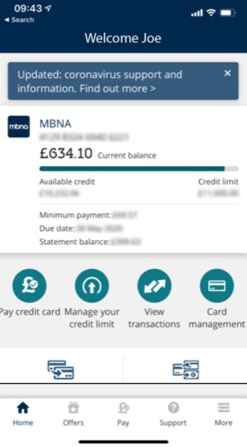
MBNA Bank
Pros Clear banners for notices, clear bar for amount available
Cons Too many circle buttons, icon style isn’t consistent
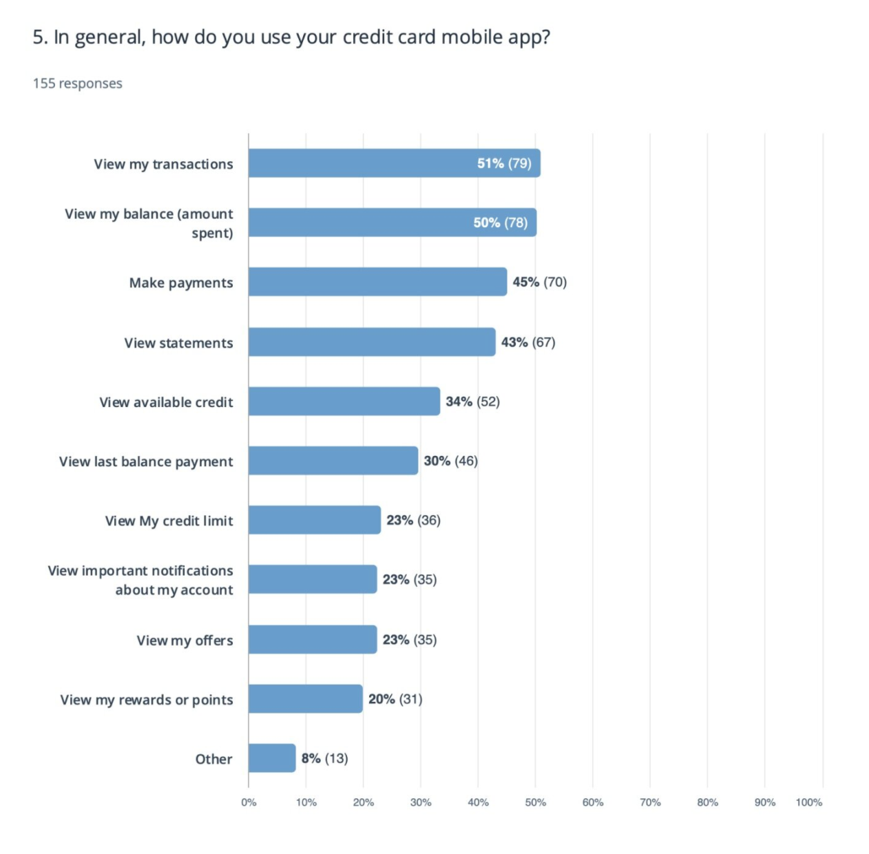
User research
The team conducted user research and worked closely with brand ambassadors and other teams such as legal, compliance, collections and customer service aiming at understanding how different areas of the business form the app ecosystem.
UserZoom was a tool we used to ask questions and get feedback. The feedback helps to understand user behaviours, needs, and motivations. This was also used to replay feedback back to the business, align on priorities and customer needs to remain objective.
Identifying our primary customers
Creating personas helped the team understand the main challenges for different customers and target the experience based on a core customer persona. The team summarised customer’s feelings, frustrations, goals and expectations to present a clear view of the core customer to stakeholders and catering for different user case scenarios. A total of 6 personas were created, but here is an example.
Defining hypothesis statements
To understand and validate how the product should work and value, the team established hypothesis statements based on preliminary findings from user testing and competitor analysis.
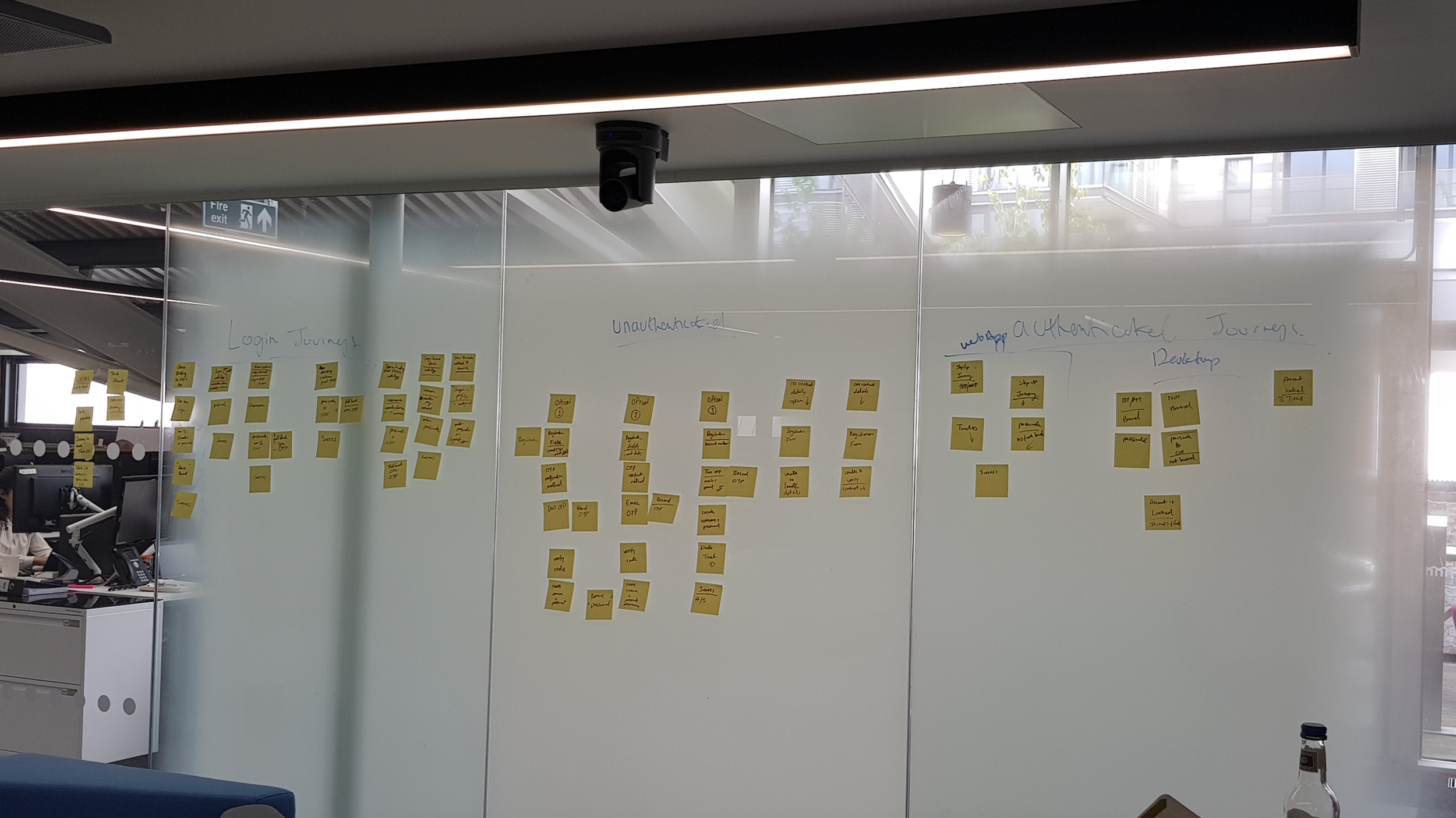
Workshops and ideation sessions
By conducting workshops with developers early on the team was able to bring alignment on the solution and was also able to leverage the technical experience from developers and incorporate into the work. Below are some of the early workshop sessions and output from the workshops to better define the MVP by using MoSCoW to prioritise requirements.
Wireframes and user journeys
The team initially explored the hierarchy of information to be included on the account summary and explored initial design directions before settling on a direction that is flexible enough to be used by all 54 brands in our portfolio.
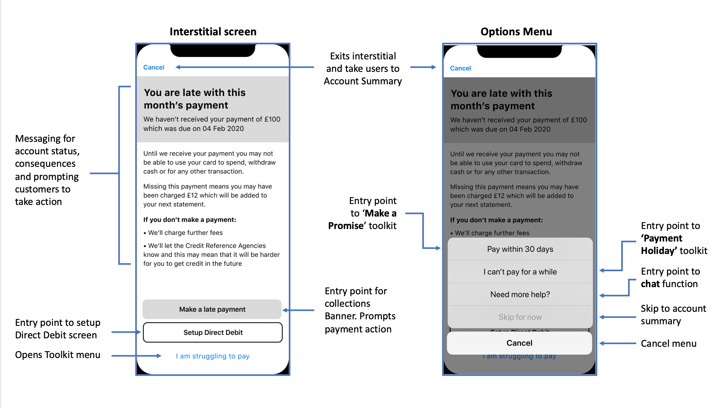
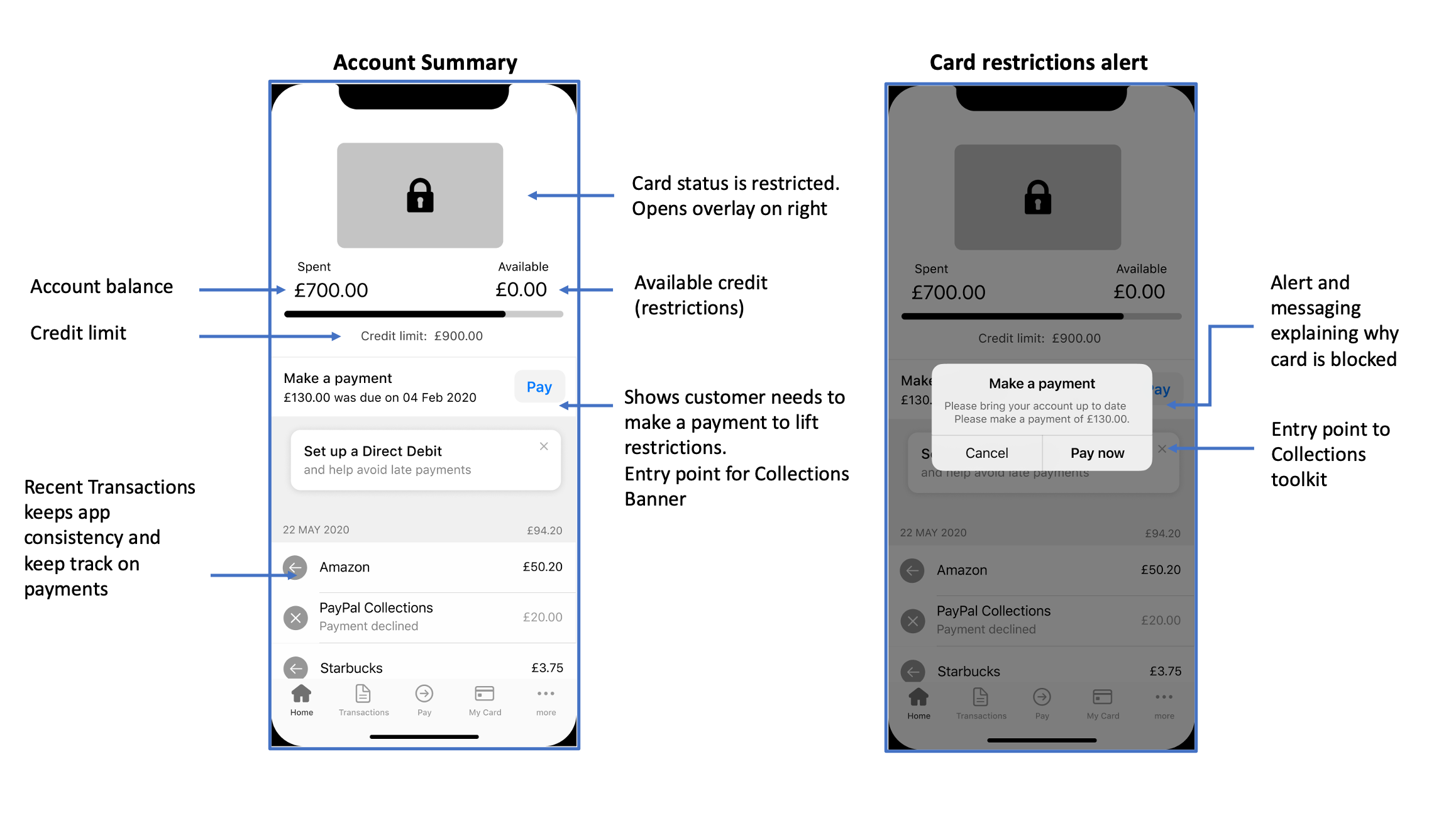
Collections customer life cycle
The team searched across the business to uncover the facts and understand how current processes were setup. This resulted in a full collections life cycle map to help people clearly see what action needs to be taken by the customer to avoid a number of scenarios.
User scenario mapping exercises
One of the biggest challenges was to accommodate all customer scenarios from being in arrears, landing in persistent debt, payment holidays through to collections. We collaborated with collection and legal teams across the business to get overall alignment. The team mapped out over 80+ scenarios and was able to create a framework able to handle all.
Collections – Arrears – 1st Payment As a user, I want to make a late payment, or setup a direct debit or promise to pay at a later date or take a payment holiday to help manage my finances
Pulling together a content matrix across user scenarios
Experience / Context matrix We created a matrix for teams to contribute and also to manage legal discussions and for legal sign-off. The banners accommodate a number of scenarios including Collections, Regulations (PD36), Functional, Marketing and other.
Framework and redesign
Clarity The redesigned experience helps to deliver as much value to the customer, giving customers a view of how much they have spent and how much money is available to spend. We made a conscious decision for labels ‘Spent’ and ‘Available’ as we discovered customers with credit cards care less about the label ‘Balance’ and care more about how much has been spent and how much is left to spend.
Design framework with scalability in mind For scalability and to enable future features like ‘Dark and Light’ mode, we decided to take a native component driven approach. Not only does this give the experience consistency but also speeds up delivery in development. To give each brand its own look and feel we used the card art, colour palette and logo of each brand, for example, Amazon uses the Amazon card art, logo and colour palette and the same for Aqua Card (NewDay own brand credit card).
Aqua card
Light mode – Aqua brand
Aqua card
Dark mode – Aqua brand
Amazon credit card
Amazon – Partner brand
Fluid credit card
Fluid brand
Dynamic banner messaging Messaging was consolidated into a dynamic banner system. We defined business logic across commercial and marketing to help surface offers like credit limit increases or balance transfers at the right time, whilst not getting in the way of the core experience. The banners simplify messaging for customers to take action and drive more positive customer outcomes.
Push notifications A huge win for the design team was when we finally managed to integrate push notifications. These were managed across 54 brands by integrating with Salesforce to give marketing teams flexibility to manage campaigns and target customers more effectively, and also allow product teams to manage push notifications for new feature releases eg. releasing digital wallets to drive adoption.
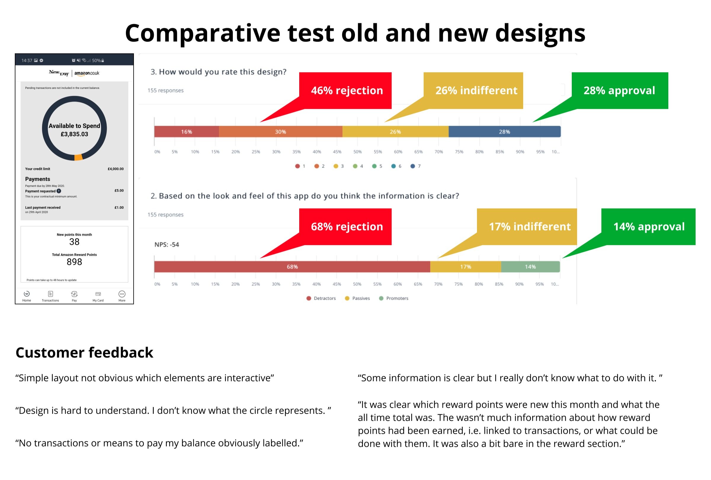
Validating designs with customers To get an understand of how well the new design performed we used Userzoom (our remote user testing tool) and asked users to perform a number of tasks through a click test.
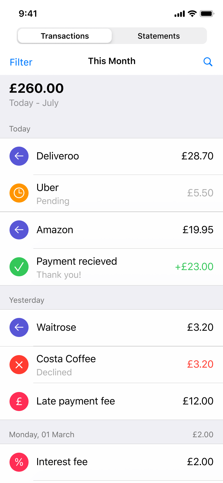
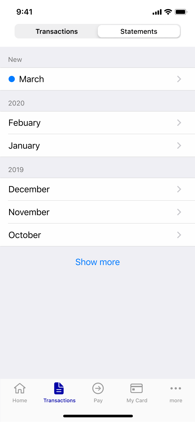
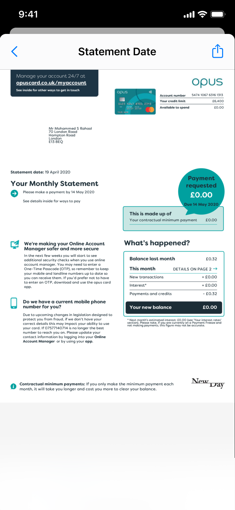
Transactions and statements
Developing further we approached redesigning the existing transactions and statements screen which needed simplifying and improving.
As an initial MVP we included iconography for transactions, which act as a placeholder default icon, whilst the development team further cleanse transaction naming and utilise merchant logos to replace the default icons.
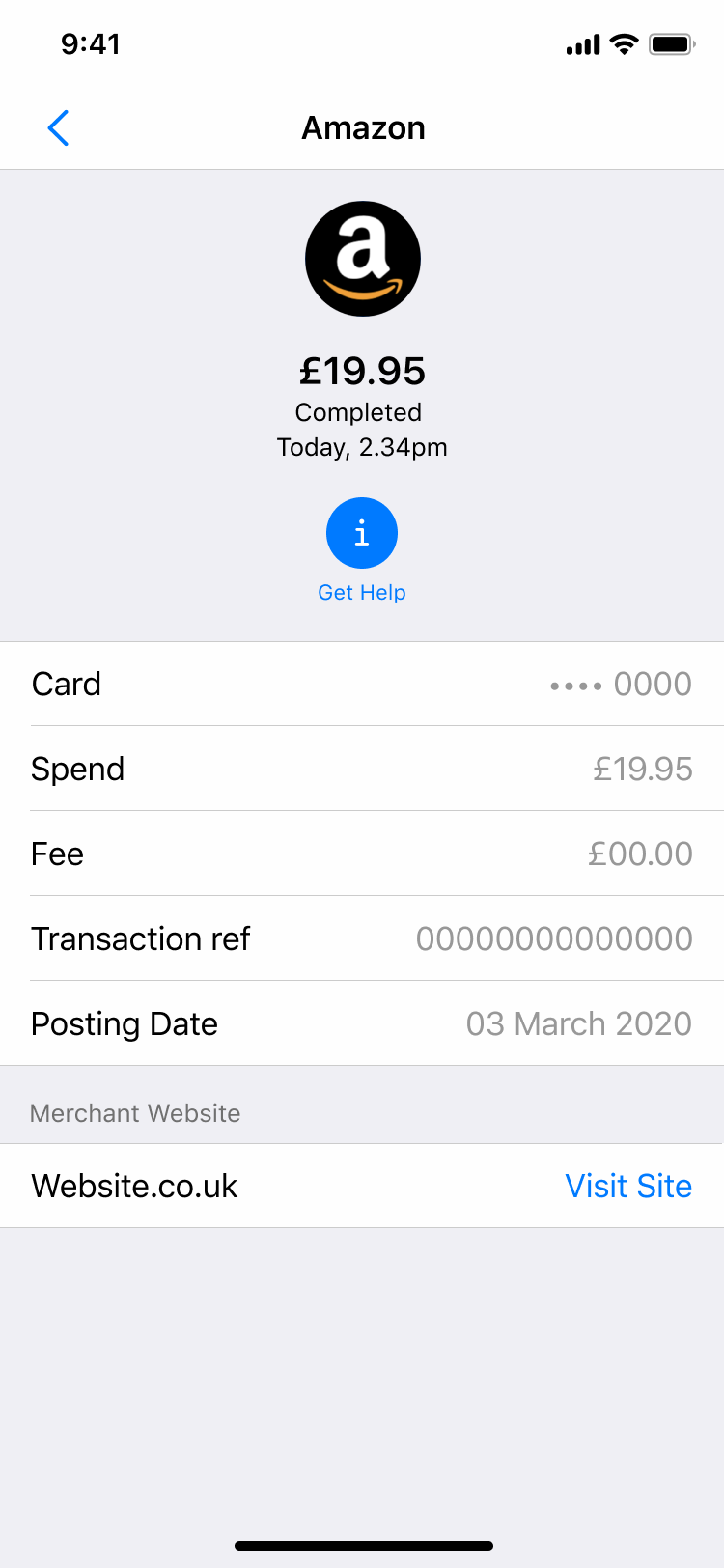
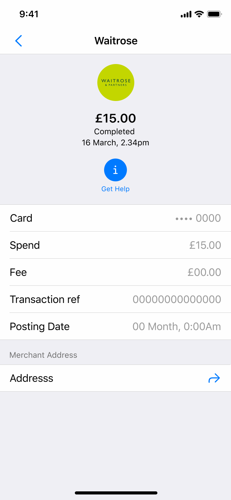
Transactions - default icon
Transactions - merchant logo
Transaction detail - online
Transaction detail - shop
Statements - new statement
Statements - statement pdf
Introducing the new account summary on-boarding
To introduce the new account summary for existing customers we designed a simple onboarding flow to help get people familiar with the new structure.
Putting it all together
As with many things, working incrementally means working on one feature at a time, but keeping in mind the overall vision of things coming together into a cohesive experience.
Here is a quick prototype of the experience from introducing new features like Aqua Coach, helping customers be better with credit to freezing your card in the My Card area.
Drive adoption of digital wallets
Digital wallets was another opportunity to offer the latest payment methods and drive greater adoption across our portfolio. Our objective was for 30% of customers to add their card to their digital wallets across iOS and Android.
Since launching we’ve seen a high proportion of organic adoption and we aim to increase this further by introducing interstitials to interrupt the experience focus the user to add their card to their wallet.
Refreshing payment journeys
Payments prototype
As part of the ongoing incremental improvements the team have completely reimagined the payments journey. Originally relying on web views for customers to make payments, the team have refreshed the core journeys and optimised the native experience across iOS and Android.
To the right is a recording of the prototype used to validate journeys with customers using UserZoom. Below is a view of the overall payments user flows.